Remember when you were cool because you used Dogpile instead of Altavista? Yeah, neither do I.
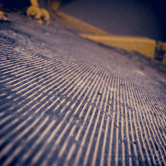
Wondering as I walked to my car today -- why does the traffic island on a four-lane road, with no traffic lights at the intersection, have "Braille trail"-style textured padding on the ground? What do the blind people do, listen for vehicles and hope they don't get creamed by a Prius?
Judging books by their covers, 2
Continuing the previous post's somewhat trendy trend:
Details: "Fire and Ice: Outrider", by Richard Harding -- currently selling new for a thrify $118.76 on the 'zon, even.
What is there to work with: Fonzie, portrayed by the bastard son of Peter Weller and Nicholas Cage, stands around in a field of polyethylene tanks leaking sunset into the sky. He has a large knife, a spare large knife, a small knife, and no knees.
Therefore the plot must be: Unable to sell functioning water tanks to farmers, Fonzie must resort to knife sales. Brandishing his entire stock of three, he shows up on the doorsteps of unsuspecting citizens to stand boredly askance, hoping someone will show enough interest in his knives that he can break out the extra special gift -- a free set of steak knifes.
Hit the jump for more, believe it or not, it gets better.
Details: "Ben Bova presents Phylum Monsters" by Hayford Peirce. Oh, yes. It's spelled "Peirce". My spellchecker hates it, too. Phylum, by the by, is the taxonomic rank that resides between "class" and "kingdom" in the taxonomic heirarchy. Likelihood of this being in any way relevant to the plot -- slim to none.
What we have to work with: Narcoleptic alcoholic butler holding a kidney takes a tipple in a room with a backwards computer with no screen, a yellow machine from Starfleet that has an LED desk lamp attached and probably goes "ping", while a hovering volleyball projects a hologram of a snoozing Doctor Zaius into the air in front of a pennant of the DNA double helix. There are SO MANY science fiction concepts crammed into this image. There's no possible way this could end badly.
Therefore the plot must be: Unable to maintain a train of thought while writing the sequel to the prequel to the third sequel of Planet of the Apes, Jeeves takes a brief respite in the DNA room. Sipping his chardonnay and gripping an authentic replica of a human internal organ, he hopes that turning his screen to the ether and listening to the dulcet tones of the yellow machine box will clear his mind and allow him to figure out the final character arc of Doctor Zaius, last seen sleeping in an extremely yellow room with inexplicable giant hairs growing from his left shoulder. Will Jeeves complete the screenplay in time? Will the studios buy it? Will Zaius ever wake up? Did Hayford Peirce spell his name wrong on the first book he ever published, and has had to live with it ever since? Is Ben Bova glad no one's spelled his name wrong? I imagine so!
There're still more to come (alas). Stay tuned!
Judging books by their covers, 1
I need to quit spontaneously spending money on things I don't need. Case in point: I recently bought a bunch (and by "a bunch", I mean 300) old science fiction novels, second hand, in differing states of disrepair. Some of them are recognisable, most of them aren't. Most of them are actually components of series' of novels, never with their appropriate predecessors and successors, thus making them largely pointless to read. I'm impressed, though, by the cover art on some of the "pulpier" novels, so I'm going to feature (read: mock) it here. In fact, the artwork reminds me to plug Ben "Yahtzee" Croshaw's old Cowboy Comics, which are still hilarious. I've included Amazon links where I'm able to, in case you feel the need to support the authors and cover artists by buying their splendid work.
I'm going to present these in the following scenario:
- What's the book?
- What's on the cover?
- What conclusions can I draw about the plot based on the image on the cover?
The logical follow up point would be "and how accurate were those conclusions?", but quite frankly, the likelihood of having time (or willpower) to read these books is insignificantly low.
The books!
Details: "Nowhere Man" by Jerry Oster, 1989
What is there to work with: Either a ninja, or a man in a wetsuit. He's armed with a 9mm. He looks depressed. The novel is a humdinger.
Therefore the plot must be: A manic-depressive scuba-diving ninja floats on his back in a pool of red custard, contemplatedly scratching his cheek with his 9mm. Nothing happens, though, because he is Nowhere Man, a superhero so ineffectual that even non-sequitir situations fail to create drama.
Details: "Lord Tedric: Black Knight of the Iron Sphere" by Gordon Eklund, 1955
What is there to work with: Captain Beardy Leatherpants slapping a sword-wielding child, while a pink bikini-wearing Viking crossdresser approaches with a stick, hoping to offset Captain Beardy Leatherpants already questionable balance.
Therefore the plot must be: Looks like a family drama. Mother is a crossdresser. Son, genetically inheriting father's bad balance, tries to protect a stain he's made on the carpet, all the while hoping his dumbass transvestite mother doesn't just walk into dad's sword, as (s)he's clearly paying no attention to her inner GPS.
Details: "Warrior's Blood", by Richard S. McEnroe, 1955
What there is to work with: Luke Skywalker, now inexplicably portrayed by Scott Bakula, leans italic-style into the background to dodge a flying sun pellet. Mistress McFaintyFaint, dressed in yellow and wearing a convenient dream catcher to hold the ensemble together does her best to keep her left thigh from collapsing.
Conclusion: It's the story of an interstellar chiropractor, travelling from planet to planet curing ailments and encouraging people to engage in fitness routines. He also sells fetching white leotards and pale yellow dresses, neither of which are designed to fit particularly well. When not performing chiropracty, Doctor Skywalker flies around space in his shoe-shaped-ship, leaving behind gigantic exhaust plumes of orange debris, which dissipate into neon space signs that advertise his business. Back pain? FOLLOW THAT NEBULA.
There will be more. (Unfortunately.)
Vintage Photo Extravaganza
I recently posted an article about smartphone apps like Hipstamatic and Instragram, and how they're ruining the originality of photography. I'm about to be spectacularly hypocritical and backtrack over a great deal of what I said. There's a caveat, though. All of the pictures I'm about to post are original, and deliberately edited. I have a huge collection of photographs. I take photos of crap constantly. I have a lot of photos that I like, but I just don't like enough to do anything with. Photos of things, photos of places, photos of the sky. Lots of photos of, just, stuff, really. On their own, none of them stand up to scrutiny. I've posted a few on DeviantART, and some of them have been successfully received. Balanced Barbs, Probably Unsafe and No Sense of Time are a few examples of images that aren't widely hated. Generally, if I post these pictures, they sink to the bottom of the pile, and I eventually delete them because they just end up as clutter.
I'm going to shamelessly self-indulge, now, and post a shit-ton of them all at once. They kind of function as a collection. Put them all together and they get a weird nostalgic feel to them, with their cross-processed filters and Hipstamatic flavour.
So, without further ado, here's a LOT of little pictures. Click "Read more" to, uh, read more. Although I suppose it's more looking at pictures than reading. Click on the images to embiggen. Enjoy!
The Haunted Calculator
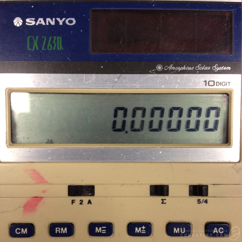
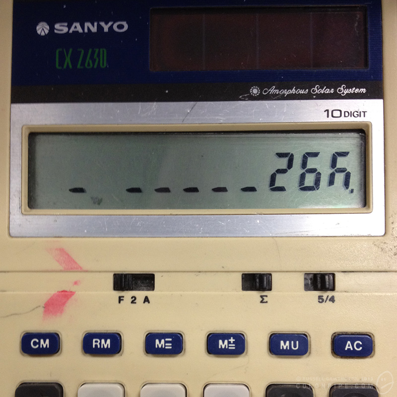
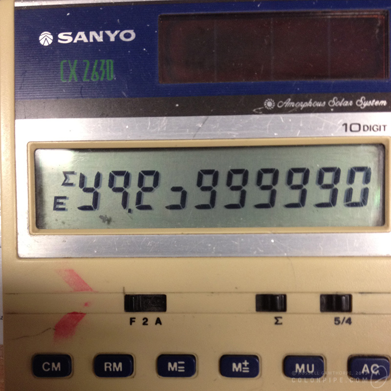
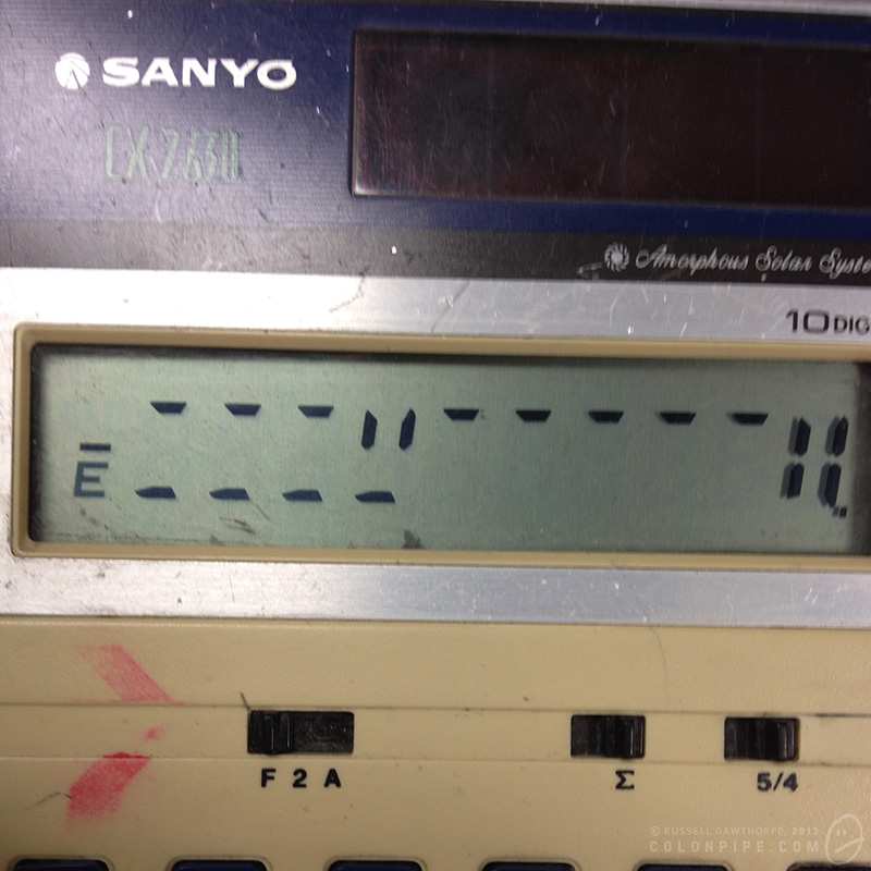
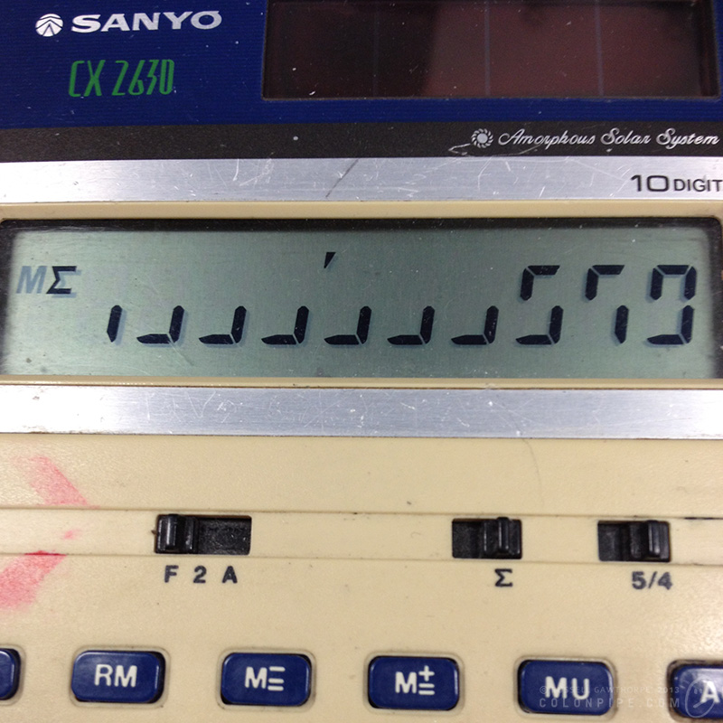
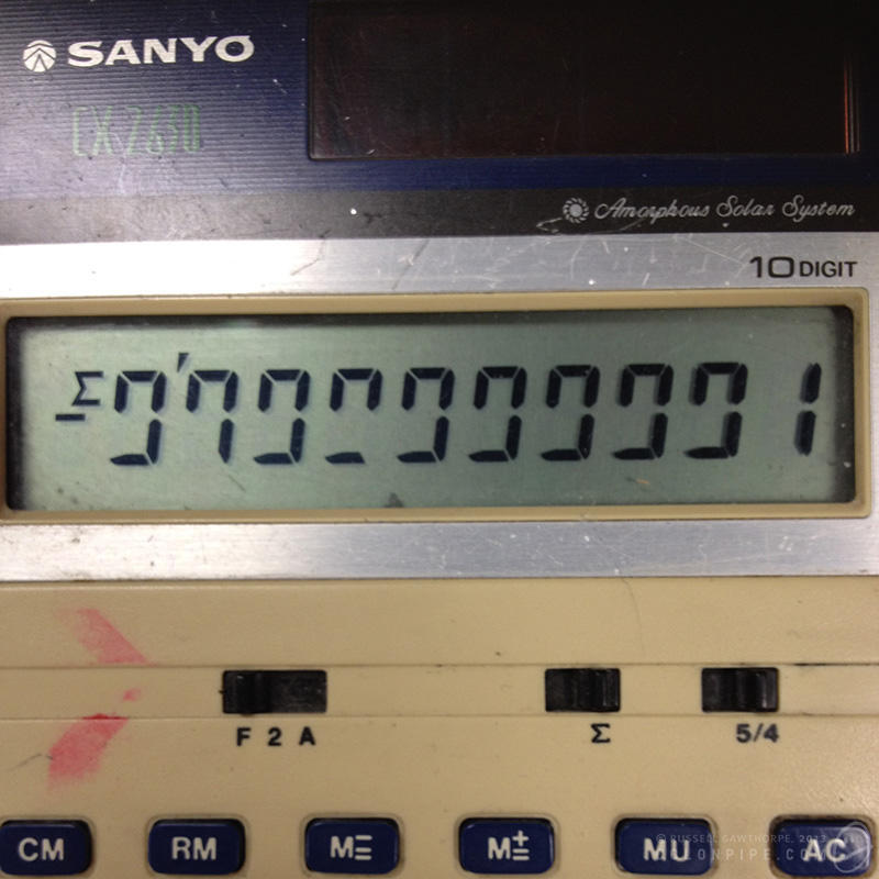
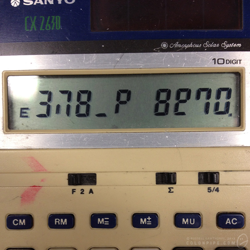
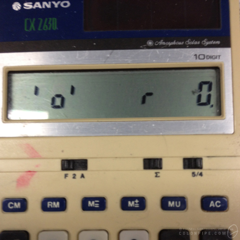
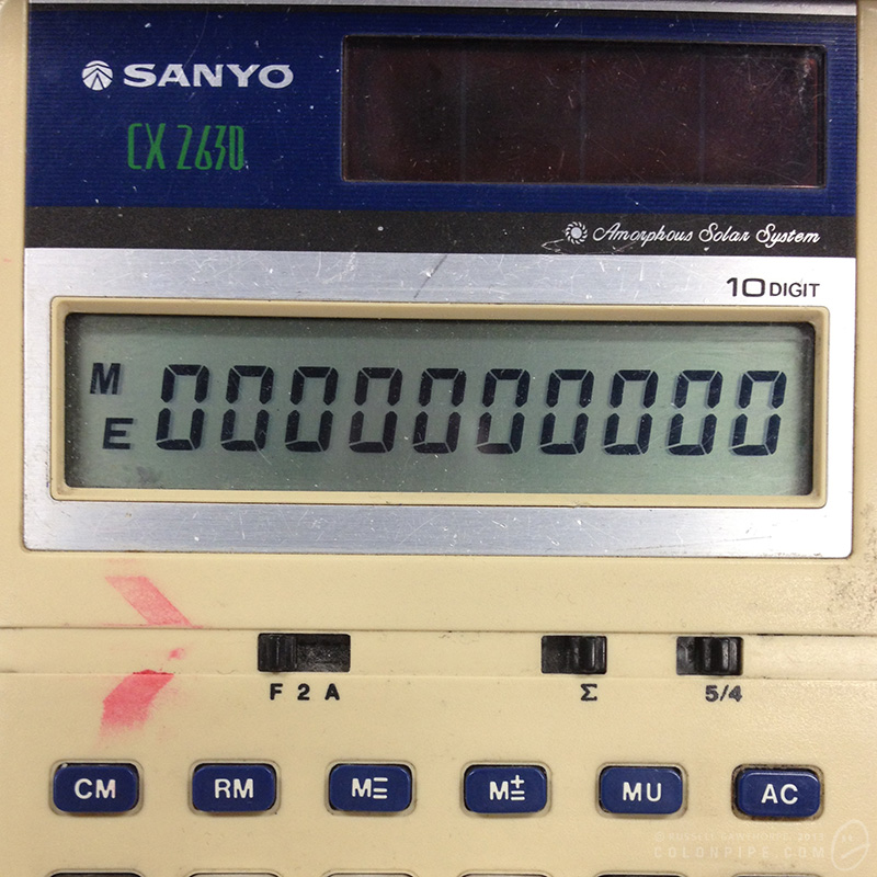
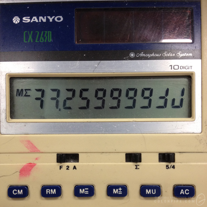
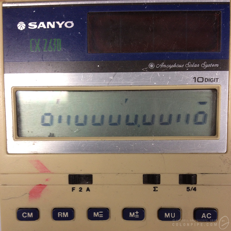
Every morning, for the past few months, I've needed to use a calculator. The calculator in question is a vintage early-1980s model Sanyo CX 2630 solar powered beast. You can read about its awesome functions at these two extremely nerdy websites: calculator.org and mycalcdb. It has all the functions you'd expect of a calculator, not the least of which is that being solar powered, it hasn't required new batteries since the Red Hot Chili Peppers released Under the Bridge. As an aside, it delights me to no end that there are websites dedicated to the minutiae of vintage calculators. The internet is a haven for anoraks. This particular calculator has issues, though. It adds just fine. Subtracts perfectly. It even handles multiplication and division with aplomb. While I haven't needed to use the function, I have the utmost confidence in its ability to calculate a square root and store the results in its memory. The thing that worries me about this calculator is
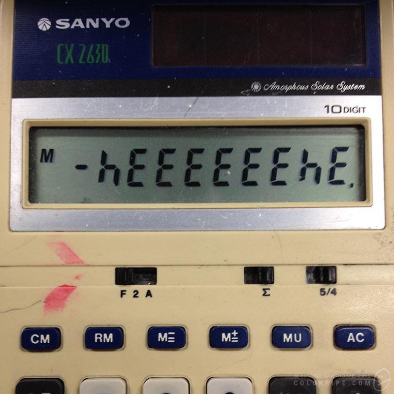
THE FREAKING THING IS HAUNTED.
Tucked away in a dark drawer, devoid of fluorescent "solar" power, its twenty year old batteries fail, and it loses its mind. Grasping at the last vestiges of its consciousness, it types a garbled message, leaving it on the screen for me to wonder about the next morning.
I've kept a log. Every time it's left me a message, I've recorded it. The original purpose of this project was simply to see if it was ever the same. Was the message similar, day in and day out? Was it just random crap? (Hint: probably!) Was there a hidden logic?
I'll let you decide. Big gallery to follow, with commentary. Hit the jump.
Vintage photo effects
I've been screwing around with various "vintage effect" iPhone apps, including Hipstamatic, Instagram and a few others of significantly lesser quality. I've started to form the germs of opinions about these apps, and I'm going to attempt to put those opinions into coherent sentences. First, lets explore the apps.
Hipstamatic is an "emulator" of the Hipstamatic 100 camera, a possibly fictional camera that sold very few units in the 1980s. Functionally, it's the equivalent of an Instamatic hand-held camera.
The software includes a bunch of effects in the guise of "films", "lenses" and "flashes". Additional effects can be purchased for a nominal fee.
Films give a range of grain, border and colour effects. Lenses give depth of field (faked, of course), focus anomalies and light leaks. Flashes overlay a coloured gel to the image, while also invoking the iPhone 4+'s built-in LED flash.
These three classes of effect can be used as intended, or mixed and matched by means of your own preferences, or random chance. Shaking the unit mixes all three effects randomly, leading to the need to take each photo several times, shaking between, to ensure you don't snag one of the myriad less desirable combinations of effects.
And oh, yes indeed, they can be undesirable. Horrific combinations can be achieved by combining lens and film effects centuries apart in design. The 1990s film that borders your image with coloured sellotape is particularly horrifying, coupled with an antique Tinto lens it's truly ghastly. Tri-coloured flashes are atrocious. The Salvador Dali film and lens combination is designed solely to pop up occasionally and make you swear loudly as it ruins otherwise good photographs with its peculiar overlaid effects.
Instagram is a different animal entirely, geared primarily toward image sharing. The sharing engine -- recently bought by Facebook for one gazillion dollars and the subject of much privacy concern after a misread alteration to its terms of service gave the allusion the company would sell your soul with your photographs to the nearest punter -- is not the part I'm concerned with today. The effects and filters, though, are.
Like Hipstamatic, Instagram offers the ability to whack on a bunch of effects. The image border and overall colour alterations are handled within a single "film" option, with about twenty different choices at time of writing, with the option to kill the border, auto-enhance the image and apply circular or "tilt shift" depth-of-field effects.
As a result of the way they're constructed, both of these apps have a different effect on your photography. Hipstamatic places the quality of your end result largely in the hands of the Gods, while Instagram gives you the ability to rub various kinds of funk on an otherwise ordinary image to make it look good enough to pollute your friends' Instagram feeds.
The issue I have with these apps is that they tend to remove the onus of responsibility from the photographer, instead allowing the person pressing the button to either blame the filters and effects for ruining an otherwise decent photo, or entirely taking self-credit for a stultifyingly boring image enhanced pointlessly with vintage funk sebum.
I once owned an Olympus point-and-shoot camera, a mJu-300. It was awesome. I actually used it to take some of my earliest lightning photographs, many of which were perfectly cromulent photographs. The camera's functions were so minimal that the only way I could take photographs of lightning was to set the camera to "party" mode, so it was expecting dark environments, turn off the flash, and hope that the ambient light was dull enough to allow it to expose for a full four seconds. I had no ability to control the aperture (f-stop) or ISO. (Although in hindsight, the little bugger of a camera had a minimum ISO of 80, which would be splendiferous on a DSLR.)
Many of the photographs I took with it, however, were not so great. This little camera gave me a super power, though: I could blame the camera. I had no controls to mess with. I had no options that could improve the image. While I could always criticise my skills in Photoshop, there was no way I could have produced more information in any of the photos I took, because there was literally nothing I could do to make them "better".
Hipstamatic and Instagram are much of the same. They're a point of blame, and a source of false credit. They're cool, don't get me wrong. Many of the images look awesome. I'm really fond of the recently released Tintype set, with daguerrotype and colourised tintype films, which look amazing. I'll also continue to use them, simply for the virtue that they tend to make otherwise boring photos interesting.
I'm going to make a concerted effort never to feel pleased with the result of a Hipstamatic or Instagram photograph, though. It just doesn't seem right.
Umbrabilis
More muzak. The title, if you're curious (and I'm sure you are), is Latin for "ghostly". This one's not as finished as I'd like it to be, but I've pored over it and I can't really be willed to do anything further with it. It's got some nice melody and some bizarreness about it. For some inexplicable reason, it also mocks the hearty power chords of every television theme song from the early 1980s' at one point. If you can spot it, you can have a gold star.
Part of the continuing deluge of "Potentia II: Extras", sequel to "Potentia II', itself a sequel to "Potentia". Bet you didn't see that coming.
Thanks for listening!
Heroes of Science
In November, I created an image called "Heroes of Science Action Figures", in which I digitally altered some Star Trek action figures to resemble famous scientists. It went a little bit viral, and has (to date, Jan 2013) some 230,000 views on DeviantART.
I've since created a "sequel" to this image, featuring all of the original scientists (with Neil deGrasse Tyson now sporting his famous Celestial Vest), plus an additional 26 new heroes. I managed to fulfil a few requests, included a few more female scientists to offset the alarmingly testosterone-laden original image, and squeeze in another couple of my own personal heroes of science.
I also created a FAQ page for the project, answering in tedious detail a bunch of questions and criticisms the graphic has received.
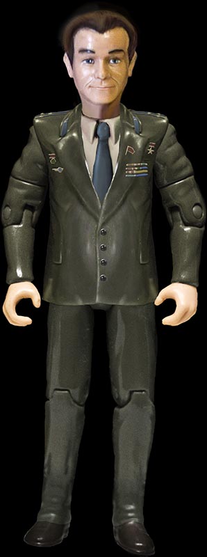
As an added bonus, here's the 27th new figure. I created the image of a Yuri Gagarin action figure before I made the decision not to include anyone who was involved in the space race/space age/space program. The reasoning behind this was entirely practical: it opened a gigantic can of worms, and I would have no choice but to include another fifty figures to do the space era justice! Maybe one day I'll make another graphic specifically for that task. :D
Thank you everyone who's supported this crazy infographic.
Science rocks.


