Hello I'm made of pixels

Super Star Wars was released in about 1872. At the time, it had splendiferous graphics. Of particular note, virtually every character from the (then only three movies wide) Star Wars movie universe was represented in a little 16-bit sprite. I intend to have a look back over said characters, and see how well they really fared.  

Boba Fett.

Fresh from his annual visit to the Coruscant Shoulder Pad Enhancement Studio, Fett sports unusually stumpy shins and a new Dragonball-Z inspired colour scheme.


Lando Calrissian.

Wearing an inverted stop-your-pet-from-licking-its-wounds cone and astronaut pants, Lando’s grinning wildly within a four-pixel radius.

Yoda.

I….I don’t know what the hell that is. At some point between The Empire Strikes Back and Super The Empire Strikes Back, yoda became a small greenish-blue peanut. Well, there you go.

R2D2.

I don’t remember Artoo’s legs being collectively as thick as his body. At least his little light is red.

C-3PO.

Threepio now sports an unexplanable coppertone tan, and has lost all of his facial features. At least his eyes will be safe from Salacious Crumb, now.

Emperor Palpatine.

Not so much the brooding Galactic emperor that put the fear of the Dark Side into you, Palpatine is now resplendant in a blue velour dressing gown and has borrowed C. Montgomery Burns’ walk. Apparently the Dark Side doesn’t cure arthritis.

Jawa.

Oo-teeny. I hated these things, they make the most annoying noises. They also weild Nintendo Super Scopes, apparently.

Tusken Raider.

It’s a hessian sack with an eye. Somewhere in the reality-to-pixels conversion, the sandpeople lost all of their facial distinction, and now appear as cycloptic homeless people.

Obi-Wan Kenobi.

The Alec Guiness one, none of this Ewan McGregor crap. His beard’s a bit longer, he seems to have a paunch. The desert’s been good to old Ben.

Bib Fortuna.

For some reason, Bib always reminded me of John Inman. Since I realised this, I’ve concluded that Return Of The Jedi could only have been improved by the actual presence of Mr. Humphries. For some reason, in Super Return Of The Jedi, Mr. Fortuna gained the ability to shoot pellets of burning something-or-other from the tip of his longest tentacle. I'll leave determining the significance of this as an exercise to the reader.

Oola.

Jabba The Hutt’s dancer, largely famous for being the only character in the Star Wars series to have flopped her boob out (Jar-Jar not withstanding, he simply was one). She’s now taken to skipping rope, and markets a splendid new line of purple leg warmers.

Luke Skywalker.

Here’s a nice piece of video game evolution, for you. On the left, we see Neanderthal Luke, hunched over and wearing a hessian bag. Central, we see College Luke, uniformed and upright, making a good impression on all. On the right, we see Goth Luke, hardened to adversary and dressed in black leather, weilding his Greenpeace-savvy verdegris lightsabre.

Chewbacca.

The old walking carpet is now an indistinguishable vertical sausage.

Han Solo.

That’d be Indiana Jones with his hat off, to you and me. Han has an inexplicable red stripe down his otherwise shmick pantaloons.

Darth Vader.

Vader’s typical dark attire takes on an unusually colourful hue, presumably because the sprite was designed to match the environment it was originally found in. Unfortunately, the sprite, originally located in the Ughnaught Mining Factory on Bespin, was lated placed in the Emperor’s Chamber on the Death Star, where no such colourful lighting existed. So Vader was having a disco all of his own, and the Emperor wasn’t invited.

I apologise for the crappy update. I’ve been busy, and truth be told, I just wanted to put the words “indistinguishable vertical sausage” to good use.

Yarr: Pirated Star Trek: TNG DVDs

I bought these because they were cheap. I bought these because I thought they were official. I mean, lots of stuff is officially released in Asia. However, I discovered once I’d bid on this item on Ebay that Star Trek: The Next Generation was never released officially in Asia. So these are not for real. Which is readily apparent when you examine them. I write this article not for sympathy, and certainly not to promote these DVDs. I write this article to warn others away from Asian import DVDs, particularly when Star Trek is concerned.

Here are the signs that will pretty much guarantee what you buy of Ebay will disappoint you:

1. Item is described as having “Asian text on discs and some menus”. In the case of ST:TNG DVDs, there’s no Asian text on the menus. The discs and boxes are loaded with it. I don’t have a problem with Asian text on the boxes or menus, however we must remember that Paramount has never licensed Asian releases of Star Trek on DVD.

2. Auction item claims DVDs will be shipped out specific to your region. Actually, they’ll be shipped out with no region encoding whatsoever, and will play on any DVD player on the planet. Due to the formalities and realities of international trade, virtually all official DVDs are region encoded.

3. No photo of the item is provided on the auction. This is because the Asian knock-off DVDs ship in hideous cardboard boxes and look so blatantly fake you’d never buy them otherwise. (And we’ve already established I’m an idiot for buying these DVDs.)

So, what’s all the fuss about, anyway? Lets examine the booty! Yarr!

The box.

This is the absolutely gorgeous box that ST:TNG Season Five comes in! I bought all seven seasons, and they progress through vile primary colours as the series spans out (pink, purple, green, blue, turquoise, brown and orange if you’re curious). I’ve only opened season five as I own official copies of seasons one to four already. I may not open any more of them, as they have an unpleasant stench of that weird glue elaborate Asian cardboard packaging is always sealed with. It’s worth noting the text looks absolutely nothing like the real ST:TNG logo. Hmm.

The box, open.

We’ve established the boxes are cardboard. For some reason, every single thing ever made in Asia always seems to be packaged in an over-the-top cardboard case, usually complete with metal hinges and clips, or a magnetic seal, and often some kind of canvassy fabric covering it. To be honest, I don’t mind these types of boxes. I think they’re classy, in a weird way. The boxes the ST:TNG DVDs are shipped in are not so classy, though.

The inside is covered with gold paper, and the lip of the case is held closed with magnets set behind the paper. The DVDs live in a recess in the box.

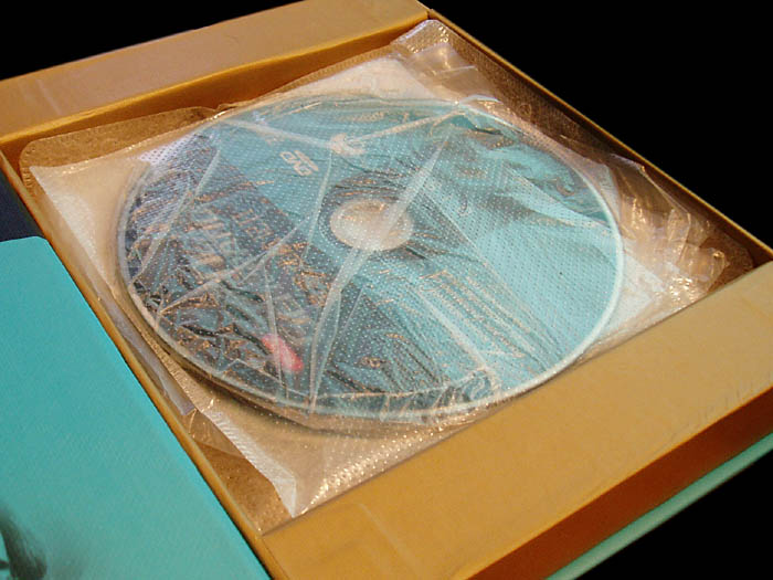
Inside. Be glad this is not smell-o-internet.
The discs themselves are packaged in incredibly cheap plastic pouches. Season five is arranged with two sets of three discs in individual thin pouches which are then wedged tightly into a third, thicker pouch. A third thick pouch houses the remaining disc. There is no booklet containing the episode names for the season, as per the official DVD sets. The inside of the cover has a crappy black and white picture of the Trek crew that has most of their faces cut off.

Gene Roddenbery (sic) would not be pleased!

One of the discs, note blobby disfiguration at 11 o’clock.

I suppose you could forgive the packaging if the discs were of decent quality, right? Well, not this time. The discs themselves have several flaws. Worst of all of these are the extremely obvious malformations around the edges (inside and out) of the discs. These look like a result of either heat damage (unlikely) or the use of extremely cheap, poor quality discs (ka-ching!).

I keep using the phrase “you could forgive these things if“, but it all comes down to this, really: You could forgive all of these things IF….the DVDs worked properly.

Do they? What do you reckon? Place your bets!

Of course they don’t!

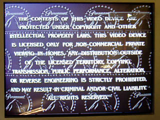
Copyright notice. How thorough.

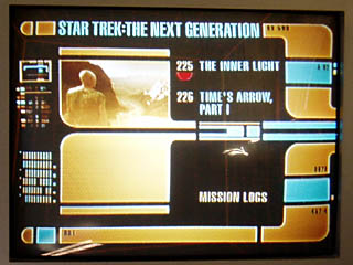
Episode menu for season 5, disc 7. Works great until..

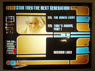
You select the last episode, and the menus for it vanish!

Selecting the last episode of the last disc, which is the disc with only two episodes and a bunch of special features, presents an issue. There’re no menu items visible. The DVD arrow thing (shown as a red semi-circle hovering to the far left of “mission logs” in the third picture above) cruises around the screen, but you have no idea what you’re selecting. Which is incredibly convenient. This is obviously a flaw in the DVD duplication process, where they’ve evidently used the same software from the other four episode discs for the last disc. The copyright notice is included, but the language selection screen is absent.

So that’s about it, really.

Almost.

There’s one other minor issue.

It’s not really that important, I suppose.

But it annoys me ever-so-slightly.

Wanna know what it is?

Oh, alright.

EVERY FOURTH EPISODE HAS NO ENDING.

No biggie.

Tiny trains: HO scale Sydney railway station

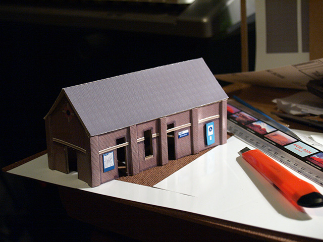
I, uh, don't have a model railroad. But that didn't stop me from undertaking a weekend project to make a tiny railway station. I've made them in 3D before, but the real world is another story. OLYMPUS DIGITAL CAMERA

The various bits are cut from thick card, the kind that photographic prints are delivered with, to keep them from bending in the post.

OLYMPUS DIGITAL CAMERA

Hit the "Read More" linky-dinky to, uh, read more. There're a heap more pictures.

OLYMPUS DIGITAL CAMERAHere's the superstructure of the building. The corners are reinforced with extra card to give them the illusion of columns of brickwork, to match the brick columns along each side. It was sheer luck that the card was the right thickness to look like added brickwork.

OLYMPUS DIGITAL CAMERA

I cheated with the exterior. The brick pattern is "texture mapped" by creating a brick pattern in Photoshop to the correct scale (HO, in this case, which is around 88:1). The folds are all scored so the thick photo paper bends nicely.

OLYMPUS DIGITAL CAMERAAll "textured". The pale blue wheelchair ramp box is popped out on a piece of card to give it depth. I built some fake shadows and staining into the texture map to give it some age and interest around the brick columns, doorways and windows. The network map and station signage is all to scale.

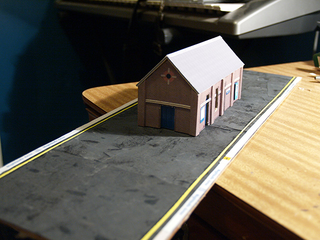
OLYMPUS DIGITAL CAMERAThe platform is not exactly long enough to be true to scale, but as I don't have a model railroad to put it in, that's kind of a moot point. The surface of the platform was a fluke -- it's very fine grit wet-and-dry sandpaper which was used to sand some items that had been painted in black paint. The glossy black paint had worn into the paper, making darker, shiny patches. It looks exactly like a gravel-on-tar surface that's been in the hot sun, allowing the shiny black tar to seep through the gravel. If I was to ever make platforms for a model railroad, I'd deliberately use this approach.

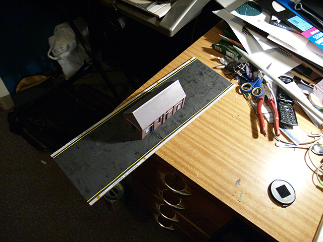
OLYMPUS DIGITAL CAMERA"Aerial" view, showing how remarkably decent the accidental platform surface turned out. The yellow lines are just strips of yellow paper cut very fine. The platform trim is white fine-grit sandpaper (no tricks, straight out of the packet) to give the illusion of texture, and the markings along the platform edge are made to scale in Photoshop and printed on photo paper. If I was to do this seriously, I'd have used matte photo paper for the things that really shouldn't be shiny.

OLYMPUS DIGITAL CAMERA

Daylight! The station is sitting on the roof of my car. The porch is made from matchsticks for support and some more of the same card I built the structure from. It's not beautiful, but it gets the job done. The lights are bits of bent wire with tiny blocks of card on the ends, painted silver. They don't light up, obviously.

OLYMPUS DIGITAL CAMERAMore detail from the platform edge. A lesson learned from this is that it'd probably be best, if I made another, to "inlay" the paper layers, rather than just gluing them on top of each other. It'd reduce the buckling and generally look better. The "2" in the yellow block is a car marker, to indicate to the train driver where to stop the train, and a bit of a joke on my part, as it's only scaled to be a two-car platform. (Ordinarily, a station of this kind would have room for at least six cars, more likely eight.)

OLYMPUS DIGITAL CAMERA

I guess this would be the view from the "other" platform, but -- of course -- there isn't one.

OLYMPUS DIGITAL CAMERA

As an added bonus, here's a tiny tiny tiny version of the old manual timetable displays that appeared on the station platforms. The real ones have a dozen or so rotating blocks with station names, this one only has four. Usually it's Strathfield marked in red, as it's a big interchange for several lines. As a joke no one will get, I've marked it as "Redmyre", which was the original name of Strathfield's station. As another joke no one will get, I've named my station "Bresnahan".

OLYMPUS DIGITAL CAMERA

Here it is, with a coin. It's very small.

Op-shoppery: Polymertex Scrabble

Any time I go searching on the 'net for something and I can't find it, I feel two things:

  1. I feel annoyed, because I wanted information and I didn't find it.
  2. I feel obligated to fill the gap with what little information I can contribute.

Back in November 2007 (this is a back-dated post), I was lucky enough to stumble across a complete set of Polymertex "Modern Plastics" Scrabble.

I think I need to get a Geiger counter for those letters.

I'll tell you what I know about it:

  • it's made in the Philippines
  • the company that made it, Polymertex, no longer exists
  • there's a Russian company by the same name, but I imagine that's coincidental
  • there's also a kind of Korean paint by the same name
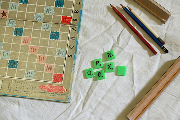
  • the tiles are so green I suspect they may be radioactive
  • it's clearly very old, as Scrabble boards go. This site/question/thing suggests in a roundabout way that it might be from 1968, which fits pretty neatly with my own assumptions that it's probably from the '60s, early '70s at the latest..
  • based on information on this website, it's "possibly one of the rarest Scrabble sets I've seen", and from the response to the abovelinked Topix question, it's apparently "superb collectors item!!"
  • from the same website comes the suggestion that it could be a trade sample, I would assume from a plastics manufacturing company

Scrabble!

There are a few things that I want to know:

  • is it an actual, licensed Scrabble game, or is it a knock-off?
  • what's it worth?
  • why are the pieces so freaking green?
  • is it worth hanging on to?

Green Scrabble. Enjoy.

Triple word score on BOPDX.

Lightning, time machines and photography

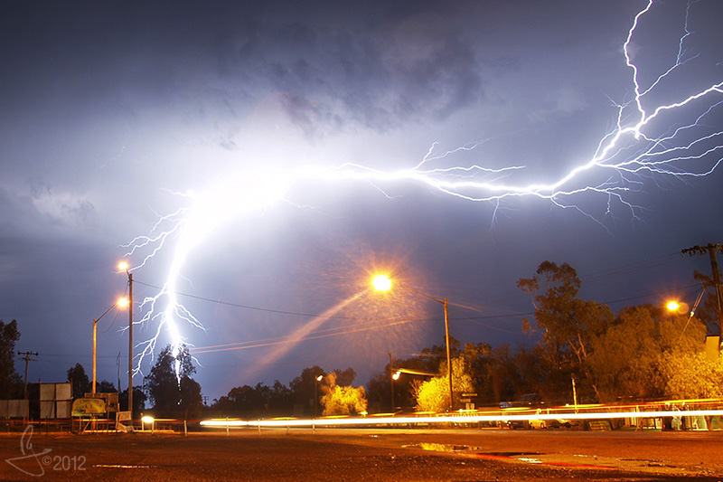
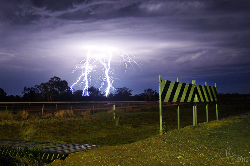
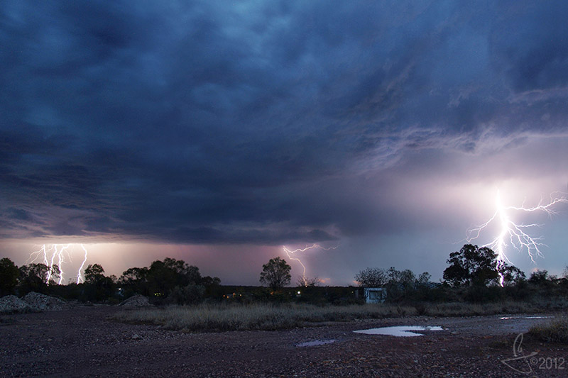
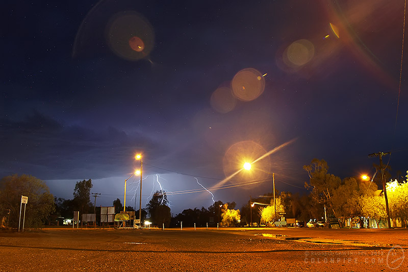
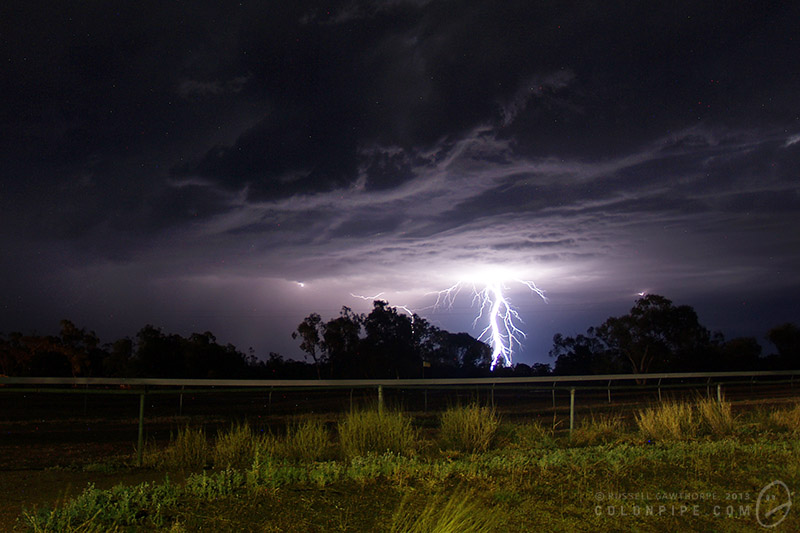
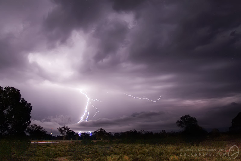
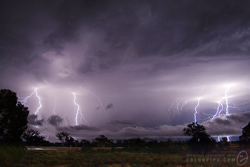
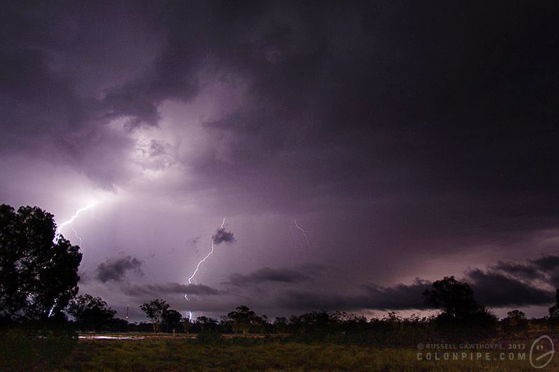
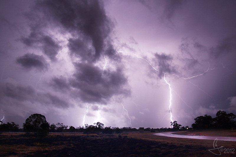
Here's a small gallery of lightning photos from the 24th of October, 2007, when a small storm skirted the outside of Lightning Ridge.

Exotic beverage review: Bullit Energy Drink

Bullit. Or BulLit. Or bulLIT. I'm not sure.

I've had this one sitting on my shelf for some time. A few months ago, I was kindly sent a package of three energy drinks from the Netherlands. (Actually, I was sent four, but one of them sadly exploded in the mail, leaving only the remaining three. Which were quite sticky.)

I've already sampled two of them, and found them to be average and disturbingly sugar-free.

I've been told, however, that the subject of this review, Bullit, is a particularly awesome example of an energy drink. At the risk of jumping to conclusions, I can't help but think:

a) it's got to be different to Red Bull. If this has been quantified as being better than other drinks, then I'm assuming it's not a Red Bull clone, which is a relief. I've sampled eleventy squillion drinks that are just Red Bull in a re-painted can, and I'm sick of it, already.

b) it may not taste as great as I'm expecting. I returned the favour by sending a package of three energy drinks from Australia back to the Netherlands. The package contained Hype, V and Mother. You can read my opinions of those drinks on the reviews I've linked to, there. In short, I don't mind Hype and V, and I think Mother is the piss of Satan's ugliest aunt. Mark, who was kind enough to send me the four Dutch drinks, disliked both Hype and V. So you'll understand my hesitation in sampling Bullit.

c) it's got the motherfucking Vetruvian Man on the can, which means it's awesome even if it tastes like brake fluid. This one gets bonus points all over for can art.

It's standard Energy Drink Yellow(tm). So far, so good.

It smells basically like (wait for it), Red Bull.

Okay, so it's not Red Bull. It's floral, it's slightly bile-flavoured, it's really well carbonated. It's kinda generic, but not at all unpleasant. (Or maybe I'm becoming seasoned.)

Exotic beverage review: Buzz Monkey Energy Drink

If you actually hear buzzing coming from the can, please don't drink it.

Wild plum extract is the keystone on this one. The can explains: "Wild plum leaf & fruit has been used for centuries by the Australian natives to sustain energy and enhance endurance during tribal walkabouts". I have to commend Buzz Monkey for not turning this beverage into some horrific racist parody of the Aboriginal culture, as a lesser drink company may have thought to do.

Finally, an energy drink that isn't just a Red Bull clone. This one features extract of the Australian wild plum.

This drink also, unfortunately, is the advertising bitch of a former late-night television program, Quizmania. Quizmania is essentially an unwinnable game targeted towards those who have difficulty determining which shoe goes on which foot. Typical quizzes on Quizmania feature questions in the calibre of "What is two plus two?", and all callers who're capable of stringing together the crude vowel and consonant string required to pronounce the word "four" are instantly screened out by the Quizmania switchboard. This leaves the daft host to ad-lib for hours waiting for the next dullard to dial the on-screen number.

It's less yellow than most energy drinks. I believe this may be a redeeming factor.

It smells phenomenally sweet, and I believe it's actually possible to smell the wild plum extract. Thankfully, there's no aroma of monkey.

I'd say this is probably 30% Red Bull/bile/flowers flavour, 40% pleasant fruitiness and a further 30% a really strong acrid flavour that is actually not at all unpleasant. This is one of the few energy drinks I've sampled that has a strong flavour that isn't solely there to mask the unpleasantries of b-vitamins and caffeine. There's a slight sensation that you might be drinking mouthwash, but it passes quickly.

The weird acrid flavouring remains for quite some time, resilient in the strange oily slick with which these drinks tend to coat your mouth.

In short, it's not bad. In fact, it's quite pleasant. It's definitely one of the stronger tasting energy drinks I've consumed, and it's also one of the few where I'm capable of drinking an entire can without wishing I'd never been born. Bravo, Buzz Monkey!

Exotic beverage review: Guaraná Antarctica

It's....green.
It's....green.

The can is green. And it doesn't say a whole bunch about what's inside. The inclusion of guarana in the title is my only basis for this being categorised as an energy drink, and I'm vaguely terrified of trying it.

The drink itself is beige. It also fizzed like a fizzing thing.

I'm tempted to say it smells like floral paint stripper, but that's probably a bit harsh. The small is actually quite faint, and you almost need to inhale the drink to smell it. It smells quite sweet, and at this point, I don't believe it's going to taste particularly bad. Only time will tell, though.

Time's about to tell.

Holy crap.

It's really nice.

I mean, it's totally benign. There's nothing unpleasant at all about the flavour. In fact, it's incredibly subtle. There's a slight, slight hint of vanilla, which is probably the source of the weird floral scent. I believe this drink works because it doesn't have the abhorrent b-vitamin groupings that almost all energy drinks suffer horrendously from. It also tastes slightly brewed, but not in any way unpleasant.

There's no noticable aftertaste. It tastes like you've just sipped some creaming soda. The brown kind, not the red kind.

Outstanding. Good things come, apparently, in poorly labelled packages.

Exotic beverage review: Rodeo Power Drink

Rodeo. It's sugar free.

This drink was kindly sent to me from The Netherlands by Kees Engels. This makes me feel bad for giving it a fairly harsh review.

The label is printed in French, Dutch, German, Czech and Polish, so this could be interesting. I believe it's manufactured by Menken Drinks in Bodegraven, The Netherlands.

It has the usual "not recommended for children, pregnant or lactating women or individuals sensitive to caffeine" warning that most energy drinks display, albeit in half a dozen languages, none of which I understand. It also has a warning that it contains phenylalanine. Joy.

This is the first sugar free energy drink I've sampled, so I anticipate it to be quite a harsh review. I'm not a fan of phenylalanine (or aspartame, or nutra-sweet, or it's billion other names), it simply tastes like vaguely sweet soap, and does not improve the flavour of a drink. Although, when an energy drink's life depends on being able to mask the unpleasant flavours of its main ingredients, I wonder how the addition of another unpleasant flavour will help it.

The can opened with a minimum of ceremony, there was no evidence of carbonation at all, but it eventually began to bubble. It appears to be the usual shade of energy drink yellow, with a slightly golden tinge to it.

Okay, so far it smells like a generic energy drink. This is a good thing. If it can pass all tests as being an average energy drink, then it's several steps ahead of what I expect from a sugar free energy drink. Hell, I may even try sugar free Red Bull if this works out. There's only one way to find out..

Well, it's not as bad as I'd expected. The flavour itself is mostly pleasant. It tastes very much like Red Bull, it has the usual flavours of tartness, slightly sickly-sweet and a bit like vomit, and clearly pasteurised. It has the slight flavour of dairy and antibiotics that most pasteurised energy drinks exhibit. However..

Over time, and given warmth, he flavour mellows greatly, becoming an unpleasantly spicy fluid. The artificial sweetener flavour thickens and becomes quite noticable when you're drinking it warm. Don't drink it warm.

The aftertaste is horrible. Artificial sweeteners suck. I've always found with drinks like Diet Coke that they taste quite decent while you're drinking them, but then you're stuck with the unfortunate reality that once you stop drinking, your mouth starts to taste like you've just sprayed it with WD-40 and sucked on a bar of soap. Well, a sugar-free energy drink is worse. The flavours of an energy drink are a procarious balance of horrible tasting things and strong, mostly pleasant tasting things. Ingredients like caffiene and vitamin-B give the drinks incredibly bitter and lasting flavours, and the added sugars and berries and whatnot basically just mask this flavour while you drink it. Almost all energy drinks have a horrid aftertaste of vitamin-B. Add phenylalanine to the mix, and it becomes entirely disgusting. The artificial sweetener grabs the unpleasant flavours of the drink, wrestles them into a malleable goo, and sticks them with great force to the roof of your mouth, allowing them to ooze slowly out over the next period of several minutes, along with the unpleasant flavour of soap and engine degreaser. Mmm. Tasty.

It's not as bad as I'd thought. I had predicted the artificial sweetener would kill it, and it kind of has. On the other hand, it's certainly not a total let down. I'll stick to non-sugar-free, myself, but if it's your fancy, then by all means, go for it.

Exotic beverage review: Pokka Milk Coffee

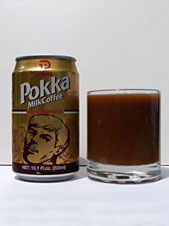
Terrible Chin Man makes an appearance on the Pokka can.

There're no medical warnings on the can, but there is a warning that "the appearance of milk particles in this product is natural and does not affect the quality". This does not fill me with confidence.

I've sampled canned coffee before. There's the Dare Shot, made by the same company that makes Dare iced coffee, which is reasonably pleasant. I've also sampled a canned coffee called K'Fee, which was extremely unpleasant. So this should be interesting.

Pokka Milk Coffee is made by the same company that makes Pocari Sweat, the infamous Japanese sports drink. It's basically just an equivalent to Gatorade, but it's named after a bodily fluid, so who am I to argue?

It's dark. And slightly translucent. And, as the label on the can warns, it's covered in bits of floating debris. There're small milk particles covering the whole surface, and something that looks like an oil slick bubbling across it. Something tells me that my first sip of this stuff is going to include all of these bits and pieces. Mmm!

Yeah, that's a kind of filmy skin of milk crud on top of the coffee, there. Nice.

It smells like coffee. It also smells slightly like long-life milk, which I guess is to be expected.

It tastes like cold coffee. Not iced coffee, cold coffee. It tastes exactly like the dregs of a mug of coffee that you've left on your desk while you've scuttled off to take care of more important tasks.

I'm unsure if this drink is meant to be consumed cold or warm. I've heard rumours that Japanese vending machines sell the product warm, which would make sense, as it tastes as though it'd benefit from not being icy cold. I scoured the can for advice on temperature, but it doesn't give one, so I went for the safe approach of refrigerating it prior to sampling it. The Asian supermarket had refrigerated cans of the stuff available, so I figured they knew something I didn't.

There's a bitterness that's exactly the same as after a cup of strong coffee.

It's not the worst thing I've tasted. Every fibre of my being wants me to dislike this drink. It's Japanese, it's coffee in a can, it's a dairy product, it's brewed. It's also sold in vending machines in Japan, which puts it at about eight on the weirdness scale from one-to-schoolgirl-panties. However, it doesn't taste too bad, and assuming I don't collapse from intense intestinal pain within the next few hours, it appears harmless.