Why Australians can't act

australia-poster.jpg

It's come to my attention, from watching movies and television, that Australian actors...can't. This is not an observation targeted toward specific actors, it's a gross generalisation that applies to all of them. Even the best Australian actors tend to perform jarringly, unnaturally and in contrast to their British and American counterparts, just plain badly. This has become rather lengthy, so I'm going to put a lead break in it. You'll need to click "read more" to, uh, read more.*

* Unless you came directly to this page, in which case these paragraphs are just here to confuse you. Confused? Good.

Rather than structure this as an essay, I'm going to present a bunch of observations, then a bunch of extrapolations, reasonings and inferences based on those observations. Some of this might be a bit vague (or, in contrast, way too specific), so bear with me whilst I organise my thoughts.

  • First up, let me make it clear that I don't have a problem with Australian films, Australian actors or Australian television programs. This is an observation based on all Australian actors, with no total exceptions that I'm aware of at this moment.
  • It's not an accent problem. While it's well known that the Australian accent is difficult to imitate for outsiders, which I don't dispute, I'm concentrating largely on Australian native actors, here.
  • Having said that, this same phenomenon also applies, largely, to actors from other Antipodes-esque locales, specifically New Zealand and South Africa.
  • Although there's another corollary to the same point: If you take an Australian actor and put them in the role of an American character (as happens with monotonous regularity), provided none of their original accent peeks through, they are as good as any American actor. Even a bad one. So, this leaves us with the distinction that the issue lies entirely with casting Australian actors as Australian characters, usually (but not exclusively) in Australian films.
  • Australian actors cannot act in US productions. When placed alongside American actors, Australians come across as unnatural, artificial characters with phoney accents that do not fit into the universe of films at all. While I'm perfectly able to watch a production with an ensemble cast made up of American, British, French, German, etc actors, throwing a single Australian into the mix is always, without fail, noticably painful.
  • Even in home-grown Australian productions, the acting quality is false and noticable. While I'm the first to admit that Australia has a relatively small film and television oeuvre in comparison to other nations' film industries (more on that later), the bizarrely bad acting appears to be an across-the-board problem, from the likes of Home and Away to full-length motion pictures.
  • We've gotten worse as time has passed. Older Australian movies, such as those prior to the 1960s, tend to have less noticable bad acting. I have a suspicion that this is a result of Australians behaving (and speaking, particularly in a film'n'theatre environment) in a much more 'British' fashion.

Theories:

  • American and British films and television shows are dilute. There're thousands of them. There's a vast abundance of bad to go with the good, and you don't have to look far to find it. The "average" water mark in cinema and television outside of Australia is not a high one. I believe the result of this is that average-to-bad actors in the US and UK are, statistically, the norm, and their behaviour on-screen has become expected and accepted. When a "bad" American or British actor appears in a high-quality production, their appearance isn't necessarily noticeable as a bad performance because they're still conforming to the expectations of the audience. Australian films and television productions, by contrast, are not at all as abundant. You could count them, if you had a weekend to spare. An Australian film is immediately compared against all other Australian films, and the comparison is fair. The average water mark is not a gigantic amorphous blob of facelessly beige film that everyone's seen but no one remembers. The average Australian film is just that -- an average film. You saw it, you remember it, you can judge the next one against it. I believe this contributes to the "Australians can't act" phenomenon greatly. Until the Australian film industry produces enough product to map out a smooth bell curve of expected acting behaviour, the highs and lows are going to continue to stand out like neon lights.
  • The US and UK film industries have, over the decades, built up an established "stylised" version of their worlds, which have become accepted by the moviegoing audience. Everyone knows that the real USA is not like the USA of the movies. Everyone accepts that what you see in a film is stylised and warped for convenience, tweaked for storytelling and stretched to meet the moviegoer's expectations. Australia doesn't really have a stylised version of itself. Audiences watching a film with Australian actors can only compare it against the Australia of real life, and it will always fall short. If an Australian film tries to use the stylised universe of the US or the UK, it will fail, because Australia is not those places, and Australian characters do not behave as American or British characters would in those situations.
  • The stylised version of Britain seems to be based around a combination of theatrical acting and cobblestone streets, but regardless, it's established, and it works. Suspension of disbelief is achieved. No one questions it.
  • Having just said that there's no established stylised version of Australia, I need to backtrack enthusiastically and correct myself: There is a stylised version of Australia that appears in film and television. We just don't like it. Australia, both internally and internationally, has a tendency to be represented on television as a stereotype of itself, with enormous sheep farms, dusty deserts and backwater hicks that talk like they've not had a single day of schooling. While these things in themselves are certainly extant in Australia, they do not form a picture of the day-to-day life of the average Australian citizen, nor do they represent the average Australian's ideal of their country. I suspect this aspect of Australia as shown on the silver screen (and the idiot box) is a detriment to the suspension of disbelief required to put stock in a production's characters and the actors that portray them.
  • The Australian film and television industries, as you'd expect, reside largely in the country's major cities. If an Australian film is set in the country, as many of them are (see above, it's the done thing for representing "Australia", remember), the actors that portray the country characters are invariably actors who were born and raised in the city. Australia prides itself -- falsely -- on not having much variation in accent. There's not a huge difference between the speech of someone from Perth vs. someone from Sydney. But there is a difference. There's also a difference between the speech of someone from Sydney's inner suburbs to someone from Sydney's west. There's considerable regional variation. If memory serves, Australia has three distinct accent classifications: urban, rural and high. Urban is the voice of the people of Australia's cities. Rural is the open-mouthed drawl of the folks from the country. High is the "posh" accent ascribed to the likes of Alexander Downer. Australian actors born and raised in the city thrown into a production set in the country have a tendency to be jarring, possibly because they didn't consider the need to study and alter their accent. Maybe this is overlooked because of the acceptance of regional diversity in accents in other countries -- it's not unusual to find someone with a New York accent in Los Angeles in an American film, and it doesn't require explanation or clarification. In Australia, however, someone from the city in a dusty outback town requires acknowledgement, or the viewer will subconsciously be aware that something is "wrong" with the character's behaviour. Worse than this, though, are actors born and raised in the city who choose to imitate country behaviour. While this is just flat-out bad acting, it's an example of overcompensation for something ending in disastrous results.

I'm going to finish these thoughts by again reiterating that I have no qualms with Australian actors or films. This is just an observation about believability, and it's something based entirely on the quantity of productions we have to sample for Australian actors, I'm beginning to believe. If the time ever comes that the pile of Australian productions is the same height as the pile of American and British productions, then I believe the quality of Australian acting will equalise, but until such a time, I suspect that many Australian viewers will continue to cringe whenever someone with an Australian accent makes an appearance, especially in a production from the US or the UK.

As an entirely unconnected thought, here's a strange little fact: There has never ever been an Australian character in the Star Trek franchise. There've been Australian actors -- Wendy Hughes, for example, appeared as Jean-Luc Picard's love interest in Star Trek: TNG -- but they've always appeared with an American accent. Food for thought, perhaps.

As a final addendum, here's a random video from the YouTube channel Veritasium, in which a bunch of folk with different accents (host is American, various Australians, one enthusiastic Scotsman) have a chat about Young's Double Slit Experiment. Notice how the Australians are not jarring against the others as they tend to do in films. Intriguing, no? Also, I bet the Veritasium peoples didn't expect a secondary language experiment was also taking place.

Strange places to find colonpipes

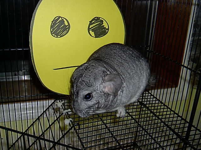
The colonpipe emoticon is quite rare among smiley faces, largely because very few people know how to properly use it. Most instant messaging, forum and blog software include graphical representations of the little face.
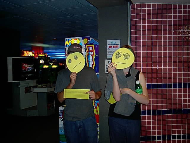
Software isn't the only place we find colonpipes, though. Hit the jump for more exciting things --

Here are some "natural" colonpipes -- "natural" being defined as "not inspired, influenced or invoked by colonpipe.com or any of its users":

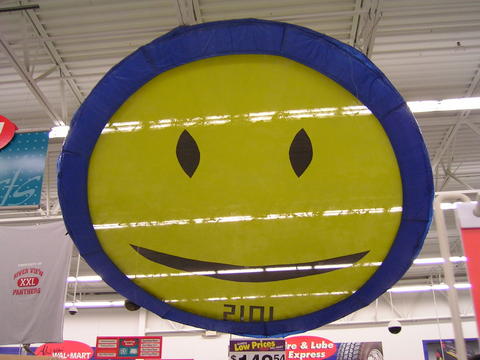
A trampoline. I don't think it's actually meant to be a colonpipe, but it's been stretched out of proportion so as to unfortunately resemble one.

This is one of my favourites. It's a little colonpipe-shaped man on the blackboard in the background of the Police music video for Don't Stand So Close To Me.

The next couple are less natural, more influenced by colonpipe.com:

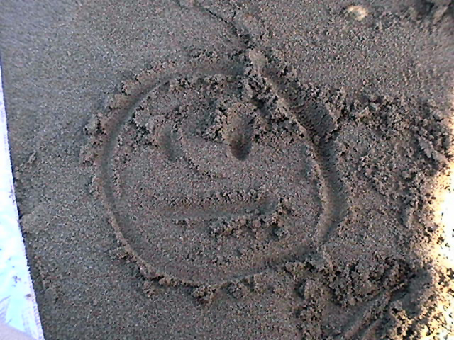
A colonpipe in the sand, on the beach in Hervey Bay, Queensland, Australia. There's absolutely no reason why a beach should not have an emoticon on it.

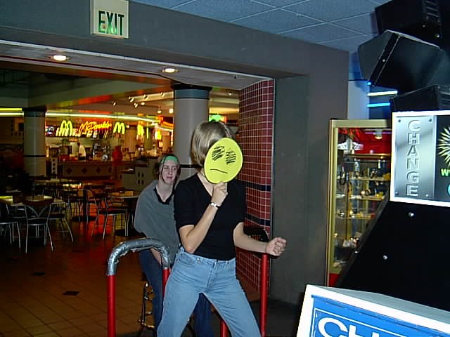
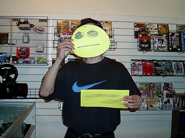
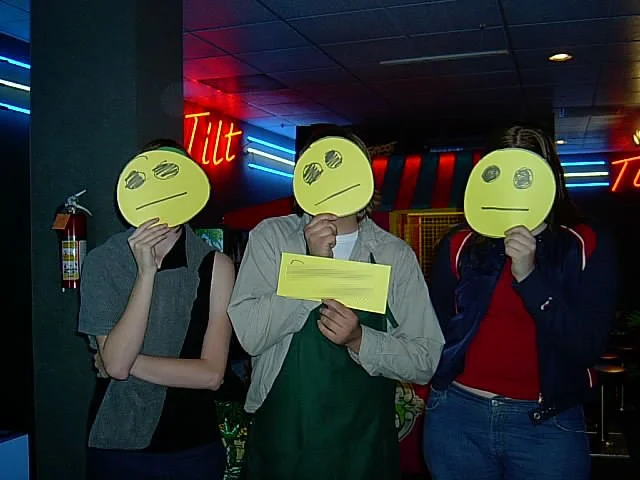
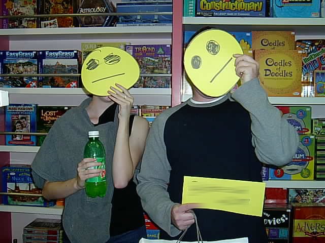
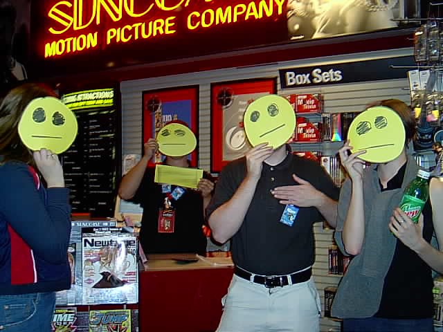
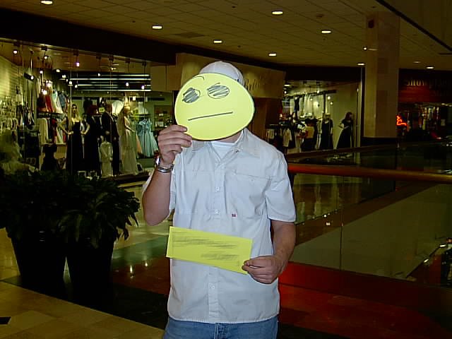
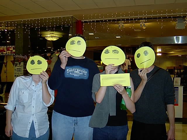
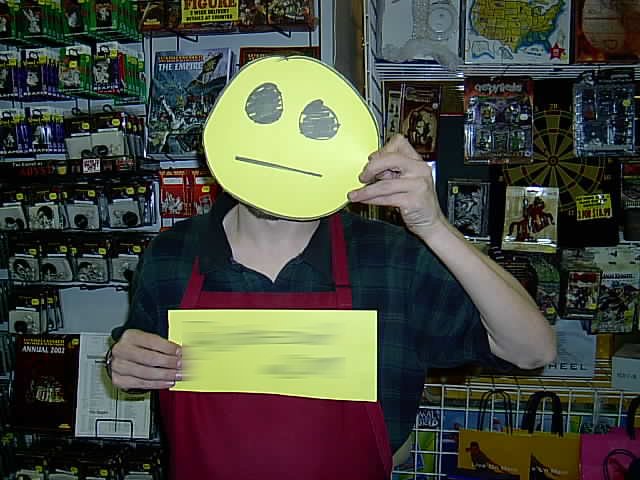
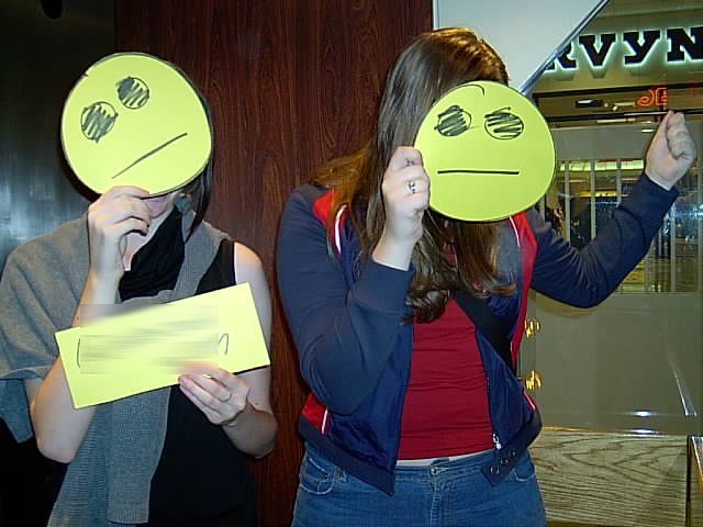
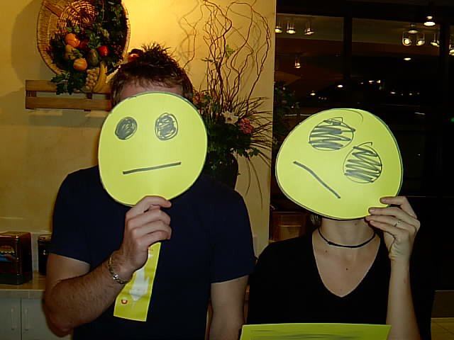
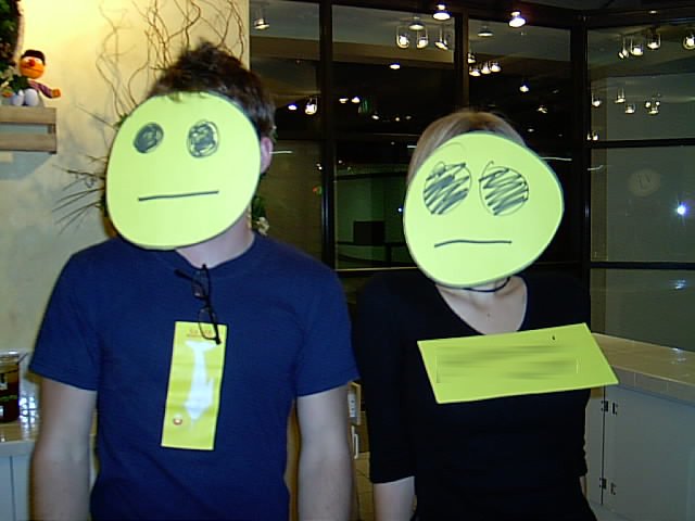
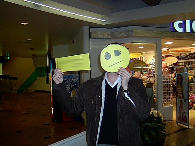
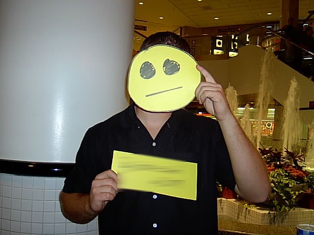
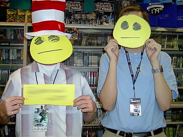
Saving the best for last, here's the awesome collage from Erica of various Utah denizens (some of which look suspiciously like Erica and Jim, but I'm no detective) holding colonpipe placards over their faces.

Stay tuned.

Too much power: The Power Lord

Continuing a very old series of comic book back cover adverts, here's one of my favourites: He's The Power Lord. What's a Power Lord? I have no idea. I've never heard of them. I can surmise, though, based on what I see before me.

A Power Lord appears to be a man with the face of Bruce Campbell, who mutates (with considerable pain, judging by the stop-motion throes he appears to be flailing through) into a red and blue man with a Cardassian forehead and massive scratches from what I assume to be a lion. Or a tiger. Or perhaps a liger, even.

There seem to be a bunch of Power Lords. One of them is a bandy-legged dinosaur. Another appears to be the inspiration for the grunts from Halo.

In reality (or rather, after having done some research), I can tell you that the Power Lords were an action figure range (really?) from 1983, and the dude pictured above is Lord Adam Power. He carries the Power Jewel (ostensibly the rock wedged in his forehead) and a laser rifle.

The others have amazingly embarrasing names, from "Disguyzor: The Deadly Deceiver" to "Ggripptogg", who lacks a byline, but I believe if he had one, it would be "the spelling error".

Here's the Wikipedia article, so you can read up on the Power Lords, Adam, Disguyzor, Ggripptogg and my personal favourite: Drrench, from the planet Frigidor.

The '80s were awesome. You really can't make this crap up.

Follow up: jesus christ they're releasing new ones

15 minutes of slight recognition: MacFormat

Here I am, back in the late '90s, critcising Apple in MacFormat magazine's letters section.

Incidentally, at some point in the past couple of decades, they fixed both of those pronunciation problems. I'd like to think I had a part in that. I'm an alpha-tester from way back.

Colonpipe: Evolution

In case you've ever wondered, here's the history of colonpipe.com, in convenient image format. This should answer a bunch of questions you didn't know you wanted to ask, including: - Has Russ ever had good design abilities? (Hint: no) - Has the website ever contained good, quality content? (Hint: no) - How many php-based randomising scripts can one actually use to create the illusion of a dynamic, interesting website? (Hint: all of them)

Many of the images below are from archive.org's Wayback Machine, which seems intent on preserving every embarrassing thing the internet has ever done.

Hit the jump to explore the history of a website that probably shouldn't be recorded --

Dark Spark: 2001.

website_april01

I'm afraid this is all that's left of my original website, from circa 2000-ish. I recall it had some kind of funky background behind it, and a banner/side menu combination that somehow fit together. It looks like archive.org didn't care to archive those images or files.

I believe the quote from Mark Twain, top right, obscured by white text on white thanks to the absent background images, was "Better to remain silent and be thought a fool than to open one's mouth and remove all doubt".

Back then, my website was called "Datazoid's Reality", and was hosted on webspace provided by my dial-up internet provider. This was a big deal in 2000, though.

For some reason, I felt that my website needed an all-genre-encompassing science fiction introductory passage, it appears.

Design wise, I have noticed: - I haven't yet learned the value of CSS, particularly for taking the damned underlines away from links once in a while. - I've actually used "valign="middle"" on the little red triangle bullets to center them. Not bad. - I remember making the little "Made with Macintosh" .gif, and thinking that it looked cool all desaturated like that. - The little gold balls that bullet-point the articles are actually rendered images, I made them in some dodgy 3D program. This was a big deal in 2000.

Other things: - I had a Global Freeway e-mail address. Global Freeway was a "free" internet provider that served you with a little application that would pop banner ads up on your screen. They never claimed to provide service for Macintosh computers, but I was pretty delighted to get my installation CD in the mail and discover that just inputting the login details was enough to give a Mac user internet access. Really bad, unreliable internet access, at that. But internet access. And without the ads, to boot. - "See y'all around"? When did I move to Texas? - I believe Josh sent me the scan of the ant farm keyring. - Guestbooks. I remember those. Good lord. The dark ages. - The block of grey crap that looks like an un-loaded image in the top left corner is actually a bunch of letters that spell out "D A T A Z O I D" and would dangle beneath your mouse pointer, in a way that couldn't possibly annoy anyone, ever. Thanks to the cleansing power of the modern internet, they now do nothing. (Either that, or archive.org doesn't archive extremely questionable Javascripts.)

What The Hell Is This: 2002.

website_2001

This one didn't last long. Unfortunately, the colour scheme must have stuck in my head, because it'll come back to bite me later on in this article.

Same website as above, ultimately, but with a spectacularly bland colour scheme and very little graphic elements. Maybe it was ahead of its time. (Maybe it wasn't.)

Dot Com Boom: 2003.

datazoid_splash_feb11

In 2003, I splurged on a domain name (or two). At this particular time, I was using data-zoid.com, after I was thwarted from "datazoid.com" by a legitimate business in California.

All good websites in the early noughties required a splash screen -- something we wouldn't dare think about anymore. This particular one, which I believe has had its html slightly cocked up as the giant "Z" should fill the white (blue?) space to the right of the various logos, resulting in a much shorter window, graced the entrance to the dot com.

The departments on the left were largely other people to whom I farmed out some webspace, in this case it was Mike, Chris, Derek and the old Rafters forum. Clicking the giant "Z" logo brought you to...

feb11_2002

..the website proper. I believe that I either had a very badly calibrated monitor, or zero understanding of contrast. Possibly both. Some of the images have disappeared from this, resulting in the little end caps from the menu titles turning into white boxes. Oops.

Turquoise and gold was probably not the wisest of all colour choices.

Not sure why I included the standard HTML-include date and time at the top. Looks kinda cool, though, I suppose. Also, pageview counter. Who uses those anymore? Who cares about those anymore?

datazoid2003

At some point in 2003, I changed the colours. In hindsight, it was for the best. In hindsight, it's still horrible, with a capital "HORR".

What we're looking at here, is the result of a man who just purchased Photoshop. The gradients, bevel-and-embosses, drop shadows and strokes on the title banner alone should be enough to make me take this image, snap it into quarters and flush it. Repeatedly.

Regardless, it's history, and I can't erase it from archive.org. It's essentially the same design as above, having gained a left column of information, no splash screen because the sub-site buttons are now below the banner, and a colour scheme that I cannot recall the inspiration for but suspect perhaps it started with "Tel" and ended in "stra".

It kind of grows on you.

The Prior Art-O-Matic still exists, by the by.

Now We're Getting Somewhere: 2003.

dec2003

Finally, towards the end of 2003, I made something work. Contrast adjusted! Colours palatable! Overly complex use of tables to create a html layout, achieved!

This is probably my favourite "look" for colonpipe.com. At some point, I changed the link colours from green to blue, but all in all, it's workable. I've actually re-used the little graphics for "post" and "comment" from this layout (albeit enlarged to 200%).

The colonpipe graphic in the logo was designed by fraxyl, and has been used pretty extensively since this design.

This appears to be the point in time when I began my obsession with 88x31 web buttons, thus explaining the army of them in the right-hand column.

This was also when I began experimenting with using a php-based random generator. The quote in the top bar was generated from a file of some 1,800 short quotes I'd collected from specific people on internet forums. Primarily Chris. The one displayed here is most definitely one of his.

"The Random News" used a half-dozen randomisers to generate parts of each paragraph, creating a similarly-constructed but esoterically madlibbed news article each time the page was refreshed.

Also, 99% of my updates back then related to searchstrings and the site's statistics. I was either destined to bore the sweet bejeezus out of every single one of my visitors, or I'd accidentally stumbled upon creating the most meta website in existence.
It's Got Nothing To Do With Your Bumhole: 2010.

colonpipe_2011

Prior to this design, there was another Wordpress-based appearance. Unfortunately, I've lost all record of it. It was white, and that's about where my memory of it chooses to erase itself. I can only imagine it was horrible, and the less we speak about it, the better. Even archive.org didn't care to record much about it, and doesn't have the CSS sheet saved. Oh, well.

This is the first colonpipe design since I actually started to take some pride in my work as a designer, and I believe it shows. The title graphic (still in use today, in some capacity) was properly rendered, and I put considerable effort into making the typography both appropriate and pretty sexy-looking. (Well, sexy for Arial Rounded, anyway. You can only expect so much.)

Content-wise, I'd boiled the entire site down to be a "best of" compilation of what had come before. This is about the point at which I realised that what had come before was largely filler, and that there was very little of colonpipe.com of which I was actually proud, and a stonkingly massive amount of it of which I was both embarrassed and terrified, to the point that I found myself retreating to a corner with the longest broom I could find, poking ineffectually at it when it drew near.

The Red Curtains: 2012.

redcurtains

Not a new design in itself, this one was just a swap-out of the background graphic. I decided -- for some reason -- to replace the stars and galaxy with a red curtain. Perhaps it lent an austere air of comedy club, suggesting wit of the calibre of Jerry Seinfeld or Larry the Cable Guy. Or perhaps it didn't. Either way, it was not to last long.

Pixelpipe: 2013.

current

There's every probablity that you're looking at this design right now. However, if it's in the future, maybe you're not. Or maybe you are. Or...who knows. At any rate, this is the design of the site at time of writing. You can see the graphics for "post" and "comments" borrowed from the earlier design. You can see the bars of social media share buttons that I loathe, but tolerate for their expected necessity. You can also see a tagline that I'm actually pretty happy with. (At least it doesn't use the word "bumhole", which has to make it better, right?)

Thanks for sticking around.

Just a quicky, but don't steal it --

Here's a little fact I wasn't aware of, brought to you by the always educational Doctor Karl: The music on that annoying "You wouldn't steal a car.." bumper on the beginning of almost every DVD in the early '00s is...wait for it...pirated music. Dr. Kruszelnicki has provided much more information than I ever could, so I point you to the above link and leave you in peace. Should you not remember the horrid advert, here's a youtube link to refresh your memory.

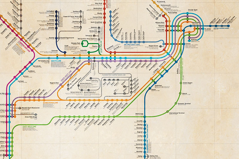
Map of the history of Sydney's railways

This is a project that I started -- and kind of abandoned -- several years ago. The story is this: Once, during a trip to Melbourne, I picked up a cool poster showing the entire railway network of the city, complete with all of the stations and lines that had closed down over the years. I quite liked it. I decided to make one for Sydney. I stupidly underestimated the magnitude of this task.

So, I edited it, on-again-off-again, until I ended up with the final version, which I display here. Is it 100% accurate? Probably not. Is it educational? Undoubtedly. Should you always do further research when presented with information on the internet? Of course you should.

Thanks to all the folks at railpage.com.au's forums who helped all those years ago, without your assistance, I would never have had the impetus to continue with this thing. Thanks also to nswrail.net for being such a ludicrously awesome resource for New South Wales railway history, and a fantastic tool for clarifying a lot of the details that went into this map.

If you find any glaring errors, by all means, let me know. I probably won't make any changes, though, because this project has very much been and gone, and it's a huge undertaking to edit it.

Click here for the full, high-res (but heavily compressed) version if you want to read the text. (Warning: is gigantic, won't work in full-resolution on an iPad or iPhone without special software.)

'tis but a preview image. Click for big. (Really big.)

'tis but a preview image. Click for big. (Really big.)

Live, from the Noel Crichton Browne room...

Who's been dancing, lewdy-style, on the tiny stage, before the dimming footlights of your mind, this week, pal? Who'd have thought there'd be more fake action figures? This time, it's Roy & H.G, from "Club Buggery", "The Bughouse", "The Dream", "This Sporting Life", and a crudload of other things.

Based on the same Star Trek: DS9 action figures as last time. Click on the image below to embiggen, if that's the kind of thing you want to do.